When I got the Santander Rewards card, there was a lot to be excited about.
The 3% cashback. A chance to see what Santander Boost actually does. And mainly, for a geek like me, the Money Manager.
One of the most important features in any banking app is exactly this: Money Manager, Spotlight, Spending Insights, analytics — every bank gives it a different name. A place that shows your financial life exactly as it is. How much you spent today, this week, this month. Clear categories, month‑to‑month comparisons, and maybe even a few genuinely useful AI insights along the way.
The reality? They’re all imperfect. Lloyds is basic and ignores your credit card. Chase integrates everything beautifully, but refuses to exclude transfers — so you’re either fully Chase or you get a distorted picture. The rest have their own flaws, but mostly along those lines.
So I was genuinely curious to see how Santander handles it. And it had one big advantage: I don’t bank with them. No income, no transfers, no noise. Just pure spending.
My expectations were pretty straightforward: The usual everyday tracking most banks now offer (except Nationwide and TSB), plus maybe something more thoughtful: trends, patterns, things to watch out for. For the most part I dislike the “insights”. For example, if I bought plane tickets that month, I don’t need the algo to tell me I “spent more on travel”. All I really want is a clear picture of my spending. I prefer to analyse it myself.
Santander’s money manager
Nearly two months in, here’s where we are:
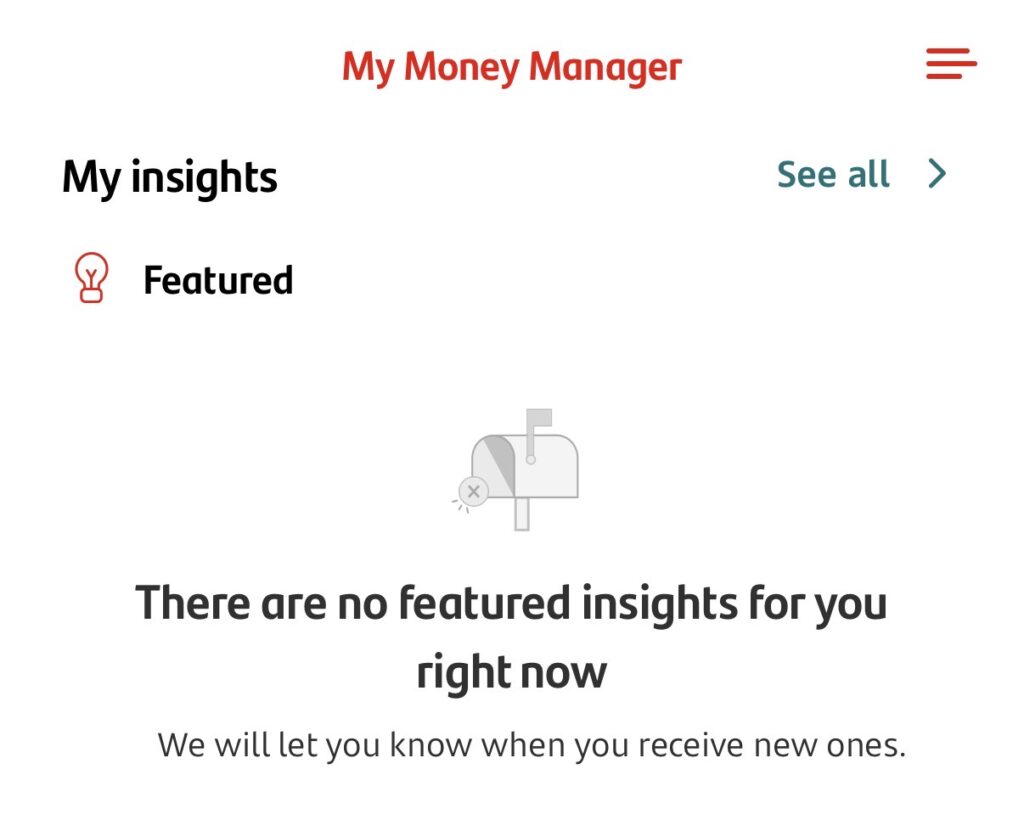
Santander Money Manager isn’t bad or inadequate. It’s worse. It simply doesn’t work at all.
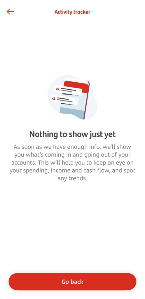
I spend on the card daily and the app still tells me to “wait for insights to appear.”
Say what you want about Barclays or HSBC — at least their insights exist.
Santander does have the edge in one regard: once payments settle, it shows the exact day you used the card. You get an accurate timeline of your payments, not the random day it stopped pending.
But that almost makes it more frustrating. The data is all there. All they need to do is place them into categories. Is it really so hard?
Final thought
This whole Money Manager situation reminded me of something: It’s often the ones that make the most noise that are completely empty inside.
Chase doesn’t even give Spotlight its own tab, and yet it’s one of the best money managers around: Money In, Money Out, Savings. It even splits bills and everyday spend — genuinely useful.
Santander gives Money Manager an icon, a tab, a whole section. And the result is quite literally nothing.
So I don’t have much more to say until they fix it. Under normal circumstances, this would be a deal breaker. But when you give customers 3% cashback, you can get away with anything.